Why Can't FCC Have as Good a Website as the Obscure FERC?
19 03, 11 14:29 Filed in: FCC website

I have written here several times about the endless clutter on the FCC website. The current website design dates to the Hundt chairmanship and may have been cutting edge at the time, but would be an embarrassment to most teenagers in this age of Facebook.
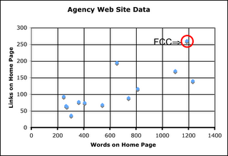
I have even given data, shown at right, that compares the number of words and number of links on FCC’s homepage compared to other agencies. While FCC’s homepage has improved slightly since this data was collected, FCC is still the leader in clutter.
Recently the Federal Energy Regulatory Commission (FERC) revised its website. FERC is the successor of the former Federal Power Commission and was created within the Department of Energy as an independent body. Like FCC it has technical jurisdiction as well as nontechnical and merger jurisdiction over several industries: gas, oil, electricity, hydropower, pipelines, etc. Like FCC it has a complex workflow.
The new FERC design manages to fit this workflow into a neat homepage that efficiently send users where they need to go. It even has room for photos (but not the names) of the 5 FERC commissioners even though no other commission in the federal government other than FCC even names its commissioners on its homepage.
Somebody has to be in charge and have the authority to tell bureau chiefs and commissioners that they can not clutter up the homepage with news of their favorite pet project. A clean, well organized homepage helps everyone quickly find the information they are looking for. It is not enough to have lots of information like the FCC website has, one has to be able to find wanted information quickly.
Other commissions and agencies have this discipline, why can’t FCC?
blog comments powered by Disqus


![Validate my RSS feed [Valid RSS]](valid-rss-rogers.png)

