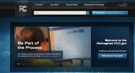
In Defense of the New FCC Website

Readers of this blog know that the problems of the FCC website have been a recurring theme. I have been quite critical of the “yellow design”. Yet until now I have not commented on the new “blue design”, except for the relatively minor FCC seal issue - since resolved.
The website has a public feedback section and many posters have been quite critical. Here are some quotes:
The new site looks very pretty, but unfortunately it appears to have been designed by graphic designers and not by anyone who actually uses the FCC's site.
Those of us who live at this site prefer the old way with everything right there. This new site is too "consumerish" and is great for Mabel Brown from Squattingpigeon, MO who is visiting the website to complain about getting calls at 2 in the morning despite her insistence that she's on the "do not call" list.. This new site (IMHO) disenfranchises the professional user.
The only way to improve this site is to bring back the old one. This new web site is just awful. It's too hard to find anything, even a simple search for a broadcast station. What a waste of taxpayer money.
Looks like a used-car sales-pitch; go back to what you had and add functionality. This looks like a site for spinning what the FCC wants to sell the public rather than a legitimate government portal to involve the public in governmental decision-making.
Very difficult to navigate as you not only moved the "stuff", but you renamed it! I spend over an hour trying to use the license "search" feature, and finally went back to the old site and found what I need in a few minutes.
The purpose of a government website such as this is not to cater top those of us who live and work “inside the Beltway” and are card carrying FCBA members. The purpose is to serve the public which includes both FCBA members and “Mabel Brown from Squattingpigeon, MO”.
Does one need to know the difference between ECFS and EDOCS in order to find public information at FCC? Does one need to know that the “Universal Licensing System” is only “universal” for the universe of WTB? Pity on anyone outside the Beltway who wants to know about or contribute to the GPS/LightSquared controversy which is hidden away on “MyIBFS” under “File Number = SATMOD2010111800239”.
The status quo ante may have been good for FCBA members who “paid their dues” but did not serve the public interest. That said, I have trouble seeing the need for multiple videos on the home page.
But the Commission has announced MyFCC which will allow people like fellow FCBA members to get directly to the information they seek. They also have be good at seeking feedback and making it public. Finally, the old “yellow design” is both still operational and prominently linked to the new design during the phase in. I think the long term scenario is that insiders will use MyFCC most of the time and those “outside the beltway” will get a site they can use too. We are not there year and feedback to the feedback page is the best way to make your voice heard.


![Validate my RSS feed [Valid RSS]](valid-rss-rogers.png)

